

Per aspera ad astra
A bit pompous, but oh well
The story began when I just couldn’t find a font for this site that fully satisfied me. All those Montserrat, Open Sans, Roboto, and the others had become so overused that they no longer felt alive or interesting.
Once again, browsing through various catalogs, I finally found a font I completely fell in love with. It’s perfect; you could admire it forever.
History & design
Signika was created in 2011 by the Polish designer Anna Giedryś. Originally, it was meant to be an extremely legible font for navigation and signage—places where text must remain clear even from a distance and at small sizes. Stylistically, it’s a humanist sans-serif grotesque: soft shapes, a high x-height, and a friendly character make it ideal for interfaces and web design. Its inspirations were Ronnia, Meta, and Tahoma.
Yes, it was exactly what I needed! But the joy of this long-awaited discovery quickly turned to disappointment: Signika exists only in Latin (albeit very extended, even covering the Vietnamese alphabet), and there is simply no Cyrillic version.
The search stretched over many months. I scoured forums, blogs, archives, and discussions. There were claims that someone had created a Cyrillic version of Signika, but it was all just images and words. No real files existed.
Eventually, again by chance, I stumbled upon a Kazakh website that used this font. Under a slightly different name, but it was indeed the same font. It included Cyrillic, but I absolutely hated how it looked.
THE CYRILLIC PROBLEM
What's wrong with you?
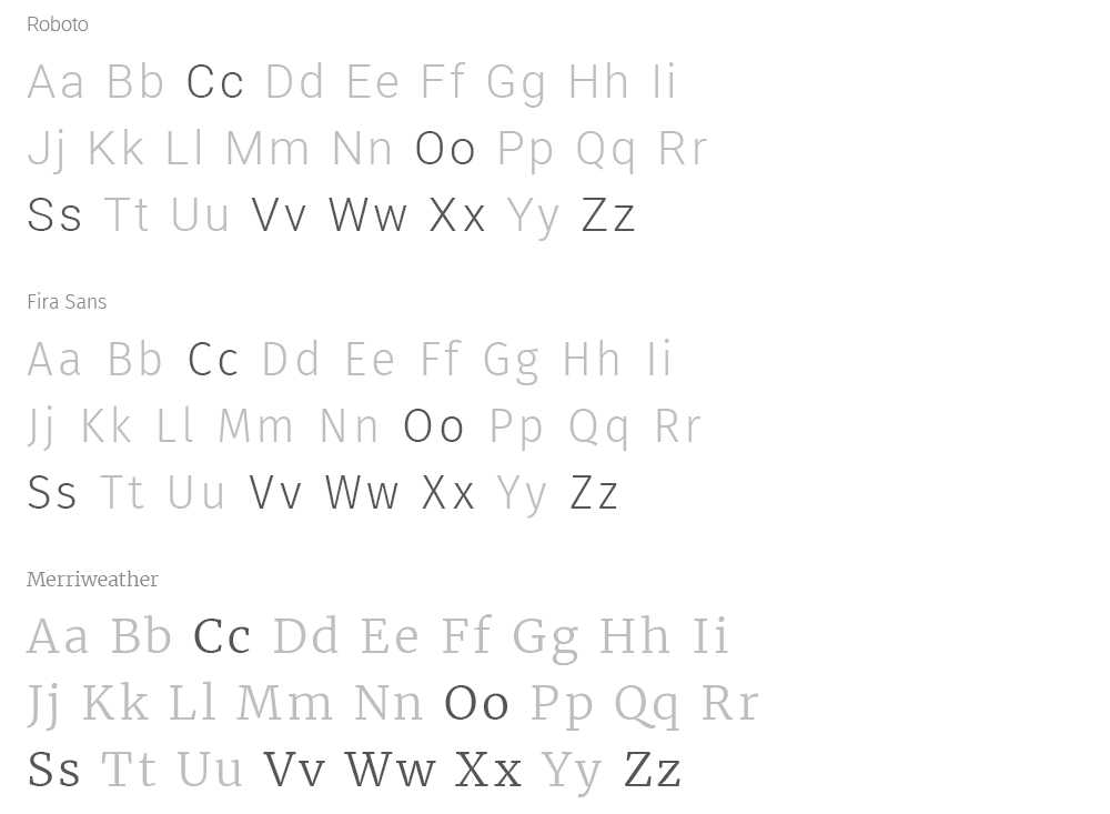
In Latin, there’s a clear visual distinction between cases: only 7 lowercase letters replicate the shapes of uppercase letters, while the other 20 have their own distinct forms:
In Cyrillic, it’s the opposite: in the vast majority of fonts, only 7 lowercase letters have distinct forms, while the remaining 30 (excluding “ъ”, “ы”, and “ь”) look like scaled-down versions of the uppercase letters:
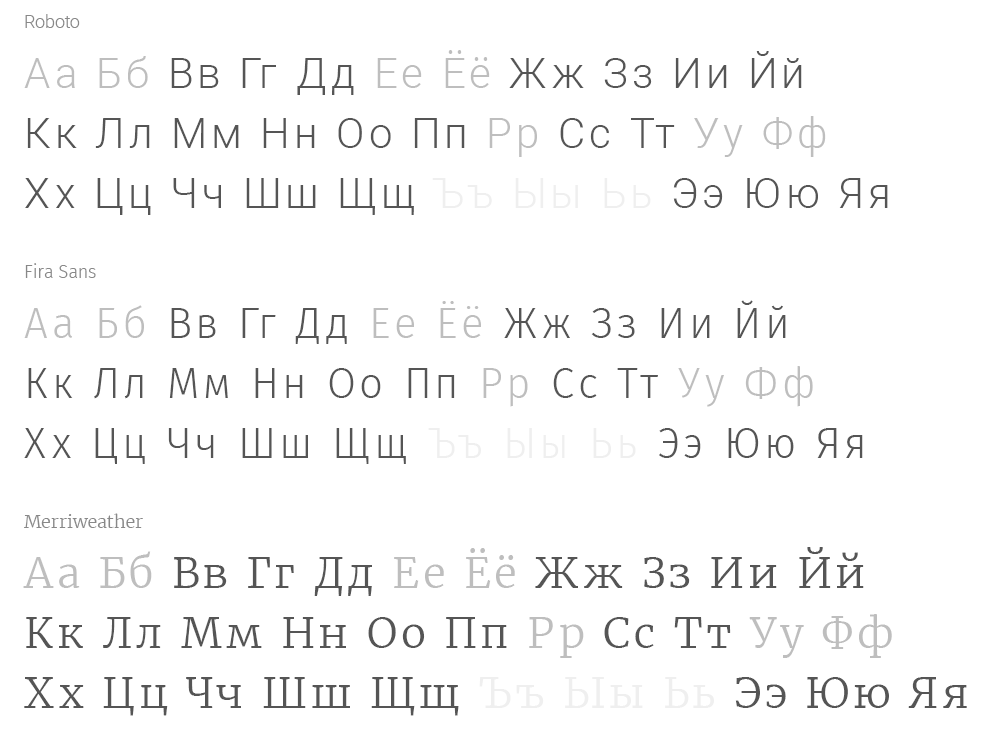
Cyrillic appeared in the 9th century based on Greek script and Glagolitic. In early systems, there was no distinction between lowercase and uppercase letters: there was just a single set of characters. Later, under the influence of Latin, lowercase letters finally appeared, but their forms developed much more slowly. As a result, many shapes remained simply reduced versions of uppercase letters.
BEAUTY WILL SAVE THE WORLD
Stand up and fight!
We’ve seen these letters since childhood, so they seem normal. Not even normal—just familiar. But I didn’t like how lowercase letters looked in Cyrillic, so, since I plan to use this font on the website and all related materials, I decided to bring them to a fully developed state—so they truly look like lowercase, not mini-uppercase.
The adjustments took a fair amount of time, but the result was excellent: now Cyrillic in this font reads naturally, doesn’t break the overall rhythm, and looks aesthetically pleasing. As much as possible, anyway.
I also slightly changed the font’s name, because it’s no longer exactly Anna’s original font, nor any kind of official version.
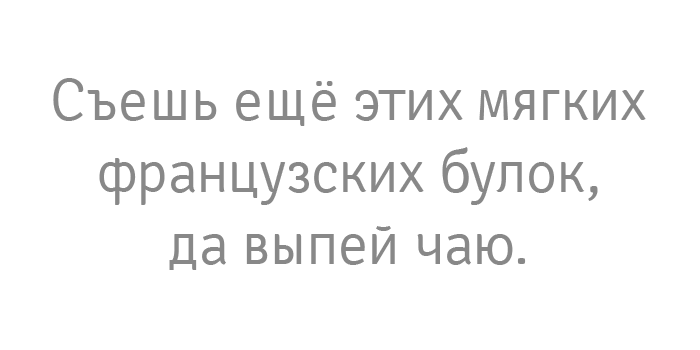
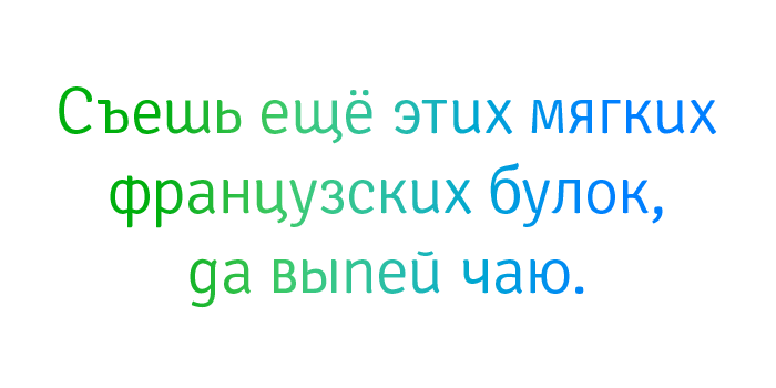
As you can understand, this font is for internal use only, so you won’t be able to download it. :)
