
La Vida Dulce
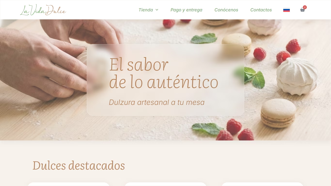
Online store for the handmade pastry shop, designed and developed from scratch. We created a convenient platform where customers can explore the product range, choose the dessert option they like, and place an order without having to communicate through social media messages. From the very beginning, the website was designed in both Spanish and Russian, allowing all potential customers to use it with the same level of comfort.
Process
Before the website was created, all sales were handled through Instagram. This format works well for introducing a brand, but over time it starts to create certain difficulties. New customers found it hard to navigate through the posts, while the owner had to regularly answer the same questions about prices, ingredients, sizes, and dessert options. Therefore, the main goal was to move the selection and ordering process to a dedicated website while preserving the cosy atmosphere of a handmade pastry shop.
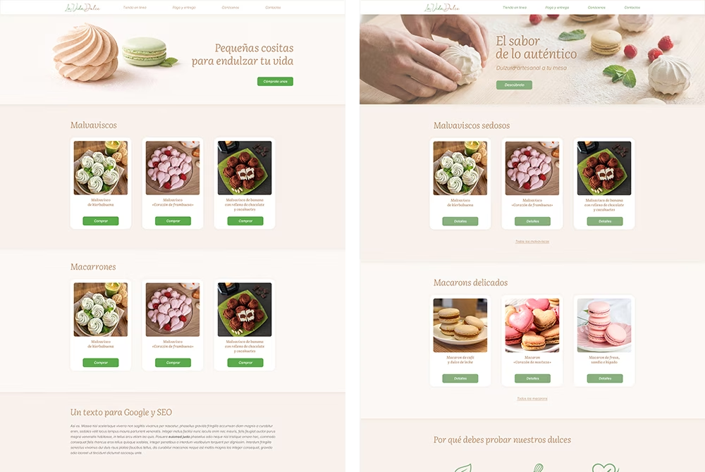
We started with the design of the homepage. We wanted the desserts themselves to attract attention from the very beginning, so we created a light, calm interface without unnecessary decorative elements. During the process, we prepared several layout options with different hero images and various colour solutions for buttons and key interface elements. This allowed us to compare different ways of presenting the content and choose the most suitable option.
The next step was developing the visual elements of the interface. We used the existing logo colours as the foundation of the colour palette and expanded them with additional shades for backgrounds, text, and other interface elements. This helped us maintain the connection with the existing brand identity while creating a complete colour system for the website.

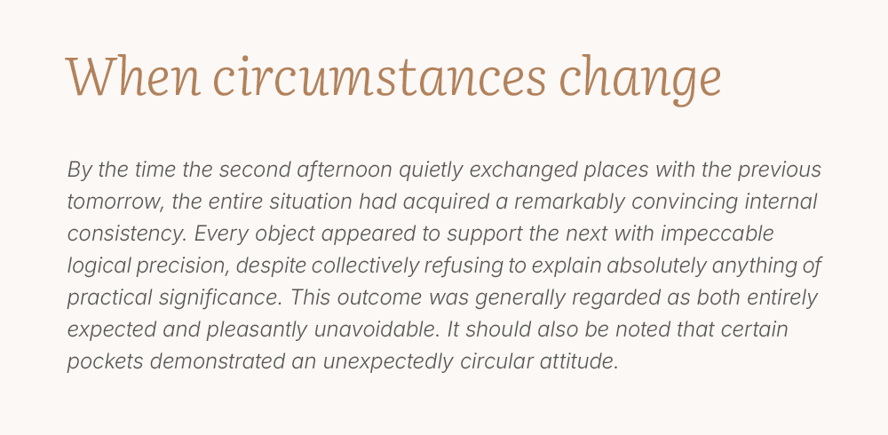
We spent a lot of time working on the typography. For the headings, we chose “Literata Italic” — an italic typeface that does not look like italic. It has elegant letterforms, smooth transitions, and a subtle flexibility in its lines. At the same time, its very small slant angle makes it calm and comfortable for everyday use. This feature creates a sense of lightness and reflects the character of handmade desserts.
For the main text, we used “Inter Italic”. Compared to the regular style, it has softer and more rounded letter shapes, which support the overall visual style of the website while remaining neutral and comfortable to read.
Thanks to the combination of these two typefaces, the entire website gained a subtle handwritten feel, although the typography does not appear italic at first glance.
We also developed a custom set of icons specifically for this project. This helped the website achieve a consistent visual style without feeling like a template, with all elements working together as a unified system.

We paid special attention to the product page, as this is where customers make their purchase decisions. Almost all products in the store have several options, so when a customer selects a specific variation, the price updates immediately without reloading the page. When the quantity changes, the total price is also recalculated instantly.
We made the checkout process as simple and fast as possible. The order form contains only four fields. This allows customers to place an order within a minute without filling out long forms with unnecessary questions.
As a result, “La Vida Dulce” now has a complete online store that has made the purchasing process much easier for customers. They can independently explore the product range, choose the right dessert option, see the price immediately, and place an order at any convenient time without having to ask for every detail through messages.

