Denis Titov
A personal website.
Also we’ve designed a business card.
Skipping the stage of paper-and-pencil sketches, the customer sends us his own mockup of the main page with descriptions of how the menu items should look like on mouse hover, and some other technical info:

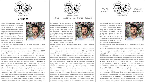
During the process of coding, we understand that it would be better to make text wrap around image to avoid emptiness below it:

As soon as our image has bottom and left margins which are large enough, we decide to justify text and to use automatic hyphenation to avoid too large white spaces between words.
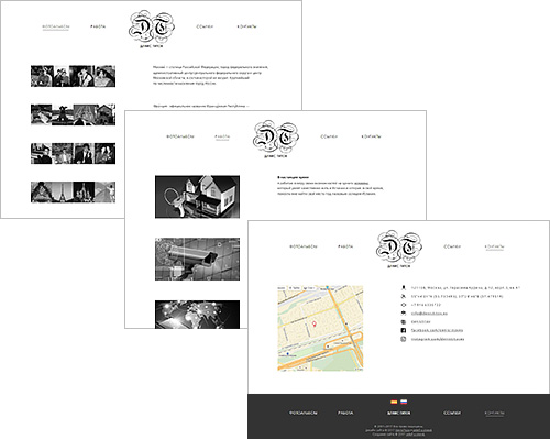
Then we make inner pages according to customer’s mockups:

Now it’s time to think about how the menu should look like in the mobile version of the website. Finally we choose the third one:

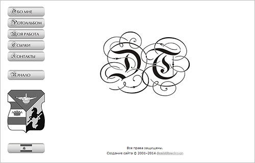
Previous version


