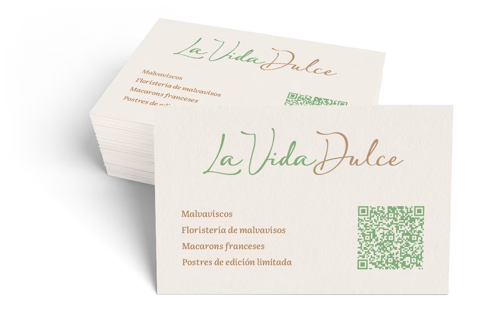
Business card for La Vida Dulce
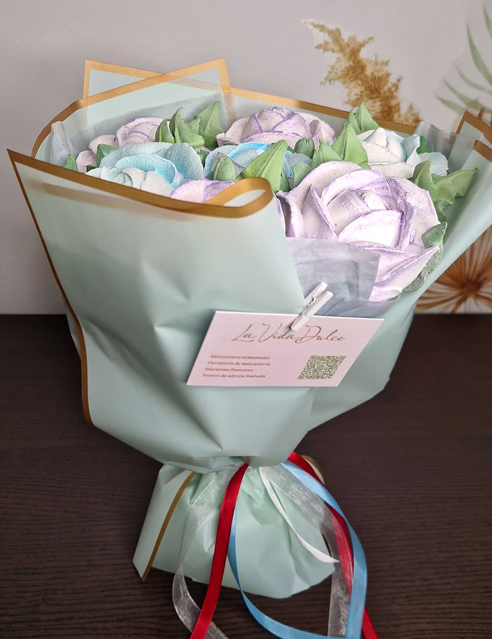
Design for a business card that solves two tasks at once: it is a standard business card to hand out in person, and a card that is attached to finished orders — bouquets or boxes.
85×55 mm.
Process
The main idea here is not to interfere. When a client receives their order, the card should not pull all the attention to itself or clash with the presentation. Therefore, we immediately decided against using photos of any products or adding unnecessary visual clutter to the layout.
In the design, we used the same color palette as on the website: a soft cream background, with pistachio and caramel tones. These colors evoke associations with something natural and tasty, yet they look premium and restrained.
To avoid crowding the small space with too much text and numbers, we tucked the contact information into a QR code. This left plenty of “air” in the layout, making the card look clean and neat.
The real-life photo shows how it works: the card complements the packaging without distracting from the product itself.